You can mix bar charts with line charts. In addition to the ability to display another data series as a line at the same time as the bar chart, you may also make use of the calculation options such as moving averages and aggregation options. This will allow you to see total turnover, trends in the data, or outliers (both upwards and downwards) at a glance.
Example: Combining a straight line mean with a bar chart (turnover for each country)
1. Select the table "Customers > Orders > Order Details" as the data source.
2. As the diagram type, select Bar/Ribbon > Clustered
3. First, define the coordinate value of the category axis. Use the formula assistant to select the field "Customers.Country".
Now define the coordinate value of the series axis. Use the combo box above the property list to select the entry "Use series to determine the values".
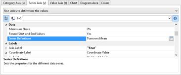
Figure 6.29: Define Series to determine the values
By doing this, the properties of the series axes change and a dialog appears for the property "Series Definitions" for the definition of the series.
4. Define a new series "Single Turnover" and calculate the turnover using the formula "Sum(Order_Details.Quantity * Order_Details.UnitPrice)" with the calculation type "normal" and display type "Cylinder".
5. Define another series named "Mean" and calculate the turnover using the formula "Sum(Order_Details.Quantity * Order_Details.UnitPrice)" with the calculation type "Average" and display type "Line".
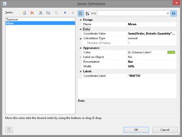
Figure 6.30: Series definitions dialog
6. The result is a turnover analysis with a mean line.
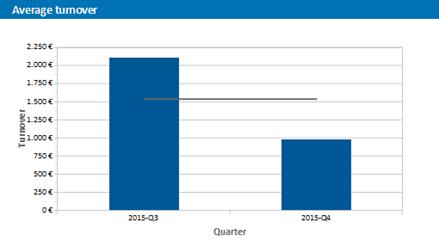
Figure 6.31: Average line
7. When using the calculation type "Line of best fit", a trend line will be displayed:
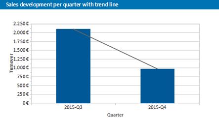
Figure 6.32: Line of best fit