There are various ways of outputting chart objects:
1. A chart as an element in the report container. Add the object via the "Objects" tool window. If you have not yet added a report container to the workspace, select Insert > Report Container (Objects > Insert > Report Container) and pull the object to the right size in the workspace while holding down the left mouse button. A selection dialog will appear for the chosen element type. Choose the "Chart" element type.
2. You can output charts and gauges in a table cell. To do this, select the relevant entry from the menu in the object dialog for the table. If you want to output the aggregated data, a good way of doing this is to use a footer line.
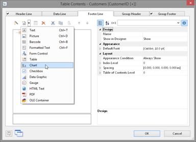
Figure 6.1: Chart object in a footer line
3. In the following dialog, now select the data source. All available tables are shown hierarchically, in other words, under the tables you will find the relational tables in each case.
To evaluate sales per country, for example, choose the "Customers > Orders > Order Details" table in the Sample Application so that you have all three tables at your disposal. The "Customers" table contains the country, the "Orders" table the order date and the "Order_Details" table the sales.
4. The chart object dialog is displayed. In the drop down lists in the top left you can select the base type and the corresponding sub type.
5. The axes are defined in the tabs (Category Axis, Series Axis, Value Axis, Data Source, Segment, Funnel Segment, Shapefile Selection). You can click directly into the live preview (e.g. onto the title or axis label) to quickly jump to the corresponding property.
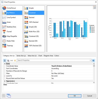
Figure 6.2: Chart object dialog
6. On the "Diagram" tab, select the general diagram options (e.g. perspective, color mode).
7. On the "Object" tab, select the general layout options for the entire chart object (e.g. Title, Background).
8. On the "Colors" tab, you can specify the colors for the display:
§ Design Scheme: Specifies the colors and color sequences for the data rows that are not specified by the "Fixed Colors". You can select a predefined color set from the drop down list. These colors can still be adjusted in the properties.
§ Fixed Colors: You can assign fixed colors to particular axis values. If you click the "New" button, you can create a new assignment e.g. Customers.Country = "Germany".
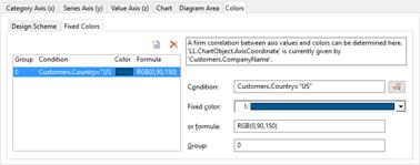
Figure 6.3: Definition of colors