Bubble charts allow for a four-dimensional representation of statistics in that, along with the position on the y and x axes, the color and the size can be defined by statistical information. Diverse options are available regarding how you would like the bubbles to be displayed.
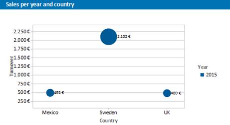
Figure 6.16: Distributed bubble chart
Proceed as follows in the Sample Application
1. Select the "Customers > Orders > Order Details" table as the data source.
2. Select Bubbles/Dots > Distributed as the chart type
3. First specify the coordinate value for the category axis. Select the "Customers.Country" field via the formula wizard.
4. Specify the coordinate values for the series axis. In the Sample Application, the order year is not supplied directly as a field so you must calculate it using the "Year$(Orders.OrderDate" formula.
5. Specify the coordinate value for the value axis and the value for the Bubble Size and calculate for both the turnover with the "Sum(Order_Details.Quantity * Order_Details.UnitPrice)" formula.
6. Under this tab you will also find the options for how you would like the bubbles to appear.